Bubble Love Nashville Case Study | Whimsical Brand Refresh
'Lavender Haze' was the name of my first drink at Bubble Love Nashville. I bought it on the day Taylor Swift's Eras Tour landed in Nashville. It’s this mix of whimsical flair and traditional Chinese bubble tea that makes Bubble Tea Nashville so special. The owner, Anna Fields, found me through another Nashville business owner I had worked with previously to help with her brand refresh. I had such a great time working with her!
When we started talking, Anna let me know that she had seen a set of custom-illustrated icons I had created for her friend. Those icons inspired her to consider something similar for her business. The tea shop had a lot of interesting and iconic elements like the colorful thick straws, clear cups with individually sealed plastic tops, and of course the friendly, bubbly boba. Custom icons for her website made perfect sense.
![]()
Since she was looking to add to her current brand, we recommended a monthly retainer to take on each custom piece and update. Our goals included custom icons, website refresh, and overall audit of her current branding.
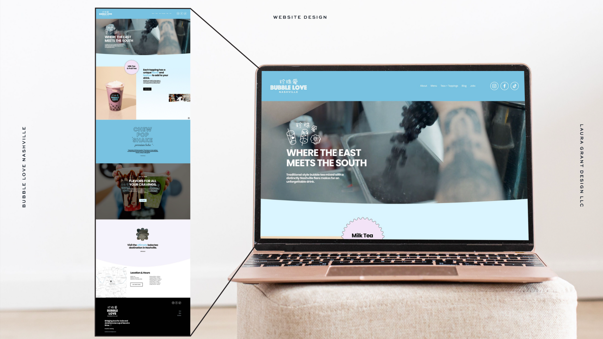
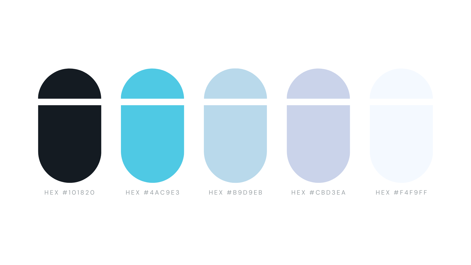
First and foremost, we started with a Vision session. I wanted to make sure that as we added to her brand, we were aligned on what her brand was and how it needed to feel. We look at keyword adjectives, ideal customers, mood, style and color. For Bubble Love, it was clear that Anna had some new ideas she'd been dreaming about. So we dove deep into what we could do with the brand no holds barred. This brought a new pillowy lavender into her color palette. It also helped us decide to root her brand in a black + extremely light sky blue. We wanted everything to feel playful, bold, and indulgent.
One project at a time, we helped fill in the gaps in the Bubble Love brand toolbox.
We refreshed their website, loyalty cards, cup monogram, menu set, media kit, social templates, and of course created those sought after custom icons. The last project was a t-shirt design that ended up being a culmination of all our favorite design tidbits.
It was important that every piece of this brand refresh felt like something you might see if you were at a tea stand in China. I didn't want anything we made to feel 100% Nashville. The company's slogan is Bubble Love Nashville, Where the East Meets the South, so the brand needed to feel half American and half Chinese. Therefore, I featured the Chinese characters prominently as much as possible. Customers needed to connect with that element of the name of their company, especially on social media, where Chinese customers would be over the moon to find them.
I had instantly connected with Anna over our mutual love for Chinese culture and food. I taught ESL and lived in Taiwan while Anna was also living and working in China. We gushed and talked about milk tea stands, and how much we missed being there. Connecting with my clients is one of the best parts of my job!
WHAT ANNA OF BUBBLE TEA NASHVILLE HAD TO SAY ABOUT HER BRAND REFRESH:
“Laura and her team have been extremely responsive and professional. As someone who has dabbled in graphic design, I have been worried that no one could make my ideas come to life since I couldn’t. Through some really inspirational conversations about my business, we were able to dream up a gorgeous brand refresh! I am thrilled with the results and I can’t wait to make the final tweaks on our menu and get it up on the wall.”
![]()
Sometimes all you need is a brand refresh to make sure that your business is telling the right story and reaching the right people. Want to get a brand refresh of your own? Reach out now!