6 Common Website Design Mistakes and How To Avoid Them
Having a beautiful and functional website is so important for any business. Your website should show that you are professional, knowledgeable, and give clear direction on how to work with you. Often, people make a few common website design mistakes that stand in the way of accomplishing all of that. As a brand + website designer, I see these slip ups all the time. Let’s talk about 6 common web design mistakes and how to fix them.
1. The header gets all the design while the body looks like a Word document.
While you want your header to stand out, you need cohesion throughout your website. Try sectioning your homepage body copy and adding things like color and subtle texture images behind sections. You can call out interesting details within your copy and make them into their own section. Another way to avoid just a block of text within your copy is to differentiate a group of main points, like your services or key points about your product, with icons.
2. You clearly went all in on your favorite colors.
A common website design mistake I see is small businesses using a color palette that is just their favorite colors. You’ll want to use a minimal palette that features a light, dark, and neutral color along with a pop color. The pop color can be used to bring the user's eye to where they need to read and click.
3. There’s too much amateur photography.
One of the first things people will notice is poor quality photos. If you’re on a budget, grab some stock photos that zooms in on one of your processes. I would recommend taking the leap and hiring a photographer that you can trust. Having professional photos specifically for you and your brand will help you stand out from the competition and maintain a consistent brand image.
If you only have a few photos to work with, use headlines for interest instead of poor quality photos. Take the opportunity to tell the visitor something instead of showing them.
4. The fonts are youthful when the business is serious.
Let’s cut to the chase – curly fonts are not the appropriate choice for any business. I recommend keeping script fonts limited. With that being said, there are some companies that use really fun typefaces but still come across seriously. Alternatively, you can reference big retail stores like Crate & Barrel or Hermes for classic fonts.
5. Your hours or contact information is wrong.
Visitors might only be stopping by your website to view this information. If they get the wrong hours and show up to a space where the lights are off, they likely won’t be back. Make a note right now to check your website’s hours of operation, contact information, and crucial details. They’re very important!
6. Your Instagram gets more attention than your website.
I know it seems easier to update Instagram more than your website, but it is important to have a cohesive experience throughout your different platforms. If you need a little assistance remembering, set a reminder to align your social graphics and your website experience. If your Instagram feed is where you do the most communicating with your audience, go for a minimal website and heavily feature your Instagram.
Common website design mistakes in action
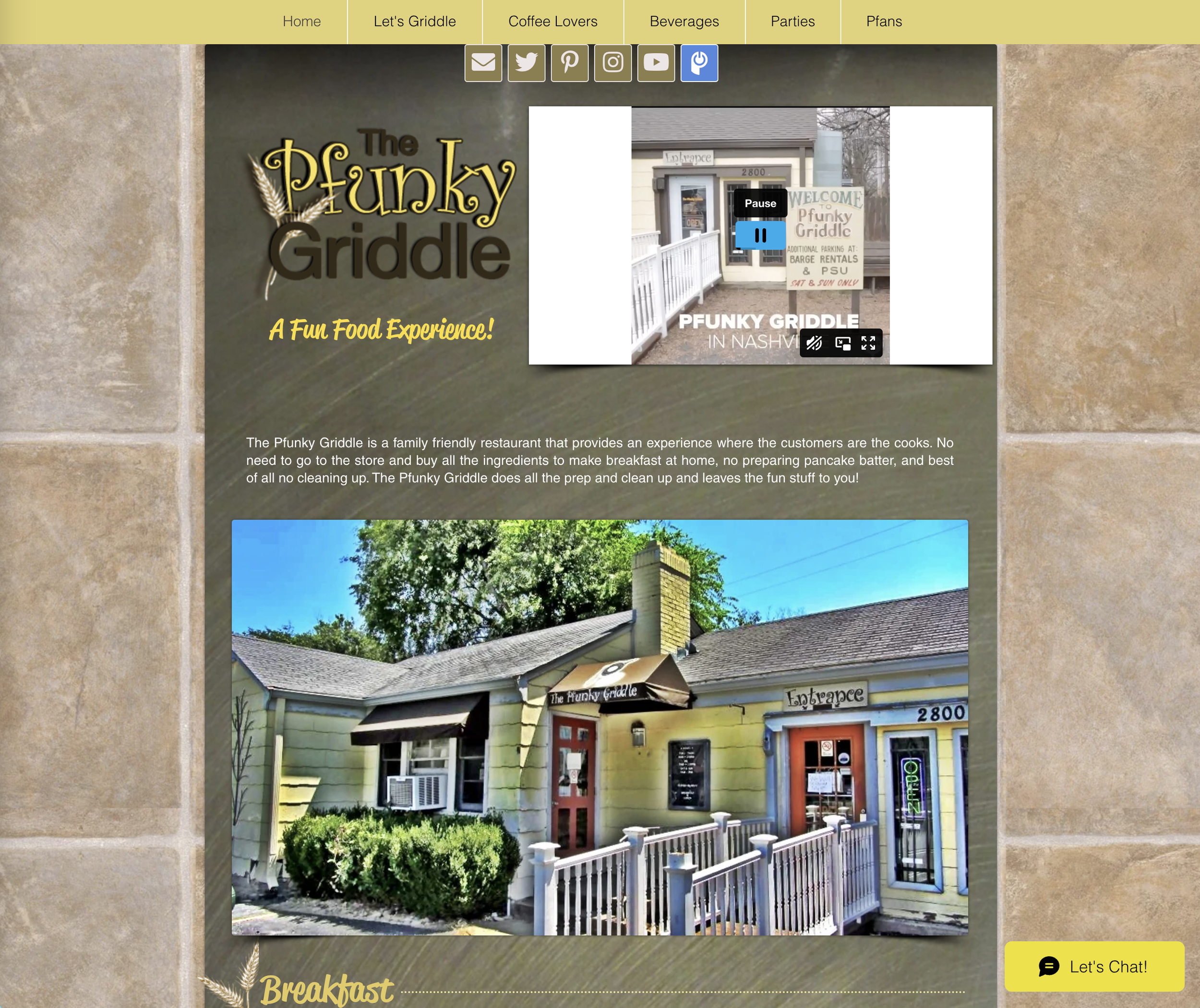
The Pfunky Griddle is a great breakfast spot in Nashville that my family LOVES. Unfortunately, their website could use an upgrade. They use curly fonts and amateur photography. Updating those pieces would definitely elevate their website experience!
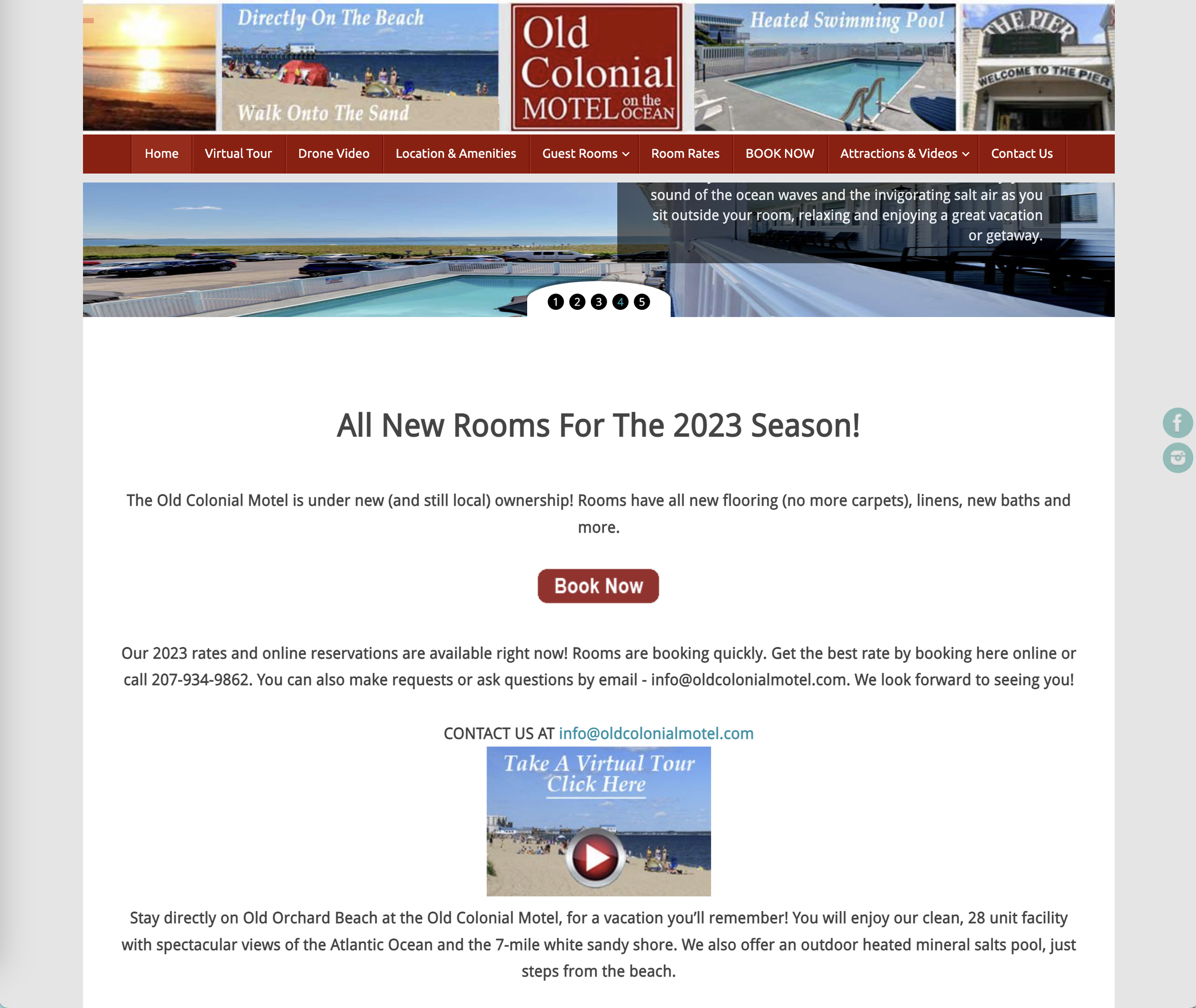
My family stayed at this hotel in Maine and it knocked our socks off. My kids say it was the best vacation of their lives! However, the website has the Word document body copy effect and could use more attention to calling out specifics and the use of icons. If the owner of the Old Colonial Motel reads this, I would love to work with you to make your website as unforgettable as our stay was!
Now that you know about these common website design mistakes, you can avoid making them! Your website and business will be better off for it. If you’d like some help with making your website the best it can be to represent your business, reach out. Let’s work together to create a website that allows your business to shine for your dream clients.